Google Analytics Dashboard Part 3 – Customize Your Dashboard
In Part 1 of this series, we looked at the basics of creating a Google Analytics dashboard, and in Part 2, we looked at events and goals as a critical part of a comprehensive web strategy, and how they show up on your dashboard. Today, in Part 3, we’re going to look at customizing your dashboard widgets.
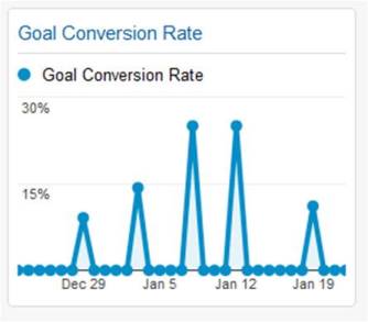
Now that your dashboard has been running for a little while (and hopefully you have a few downloads to report), it’s time to start customizing it. We’re going to work with the “Goal Conversion Rate” widget. This shows the percentage of visits that resulted in a conversion to one of your goals. The widget should look something like the image below.
But now, suppose we want to make a change. We’ve decided, perhaps because of a business initiative or new focus, that we don’t want to lump all of the goals into one pot, but we want to know what’s happening specifically with Goal 1 (which we named “Product XYZ”). Also, we only want to know what’s happening with this goal in Canada, because we’ve just launched a nationwide advertising campaign, so we’re looking for feedback only in the one country.
Fortunately, our dashboard widgets provide some easy-to-use means of changing our data. If you put your cursor in the top left corner of the “Goal Conversion Rate” widget, you’ll see two symbols appear. Click on the one that looks like a pencil, and this will take you to the Widget Settings screen, as seen below.
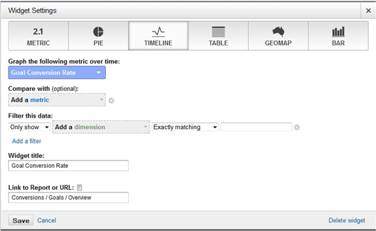
This is where we can make some changes to the data being shown, for instance, limiting the goal conversions to our first goal. In the pull-down that says “Graph the following metric over time”, change this from the current “Goal Conversion Rate” to “Product XYZ (Goal 1 Conversion Rate)”. Now, we want to only consider Canadian traffic, so we’ll do that with a filter. Click on “Add a filter”. Where it says “select a Dimension”, set this equal to “Country/Territory”. In the final box, enter “Canada”. We may want to change our title at this point to say “Goal Conversion Rate – Product XYZ in Canada”, then click on “Save”.
And you’re done. Now, your widget shows you exactly the data that you had determined is important for your business.
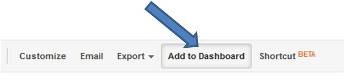
But, now what about adding new widgets to the dashboard? There are two ways of doing this. First, you can build a widget from scratch, right from the dashboard, using the same interface that we used to edit our first widget. But there’s an even easier way than this. Probably, if it is some data that is important to you, then you have already looked at it in the standard or custom Google Analytics report. While you’re looking at the data in reports, you can add it to your dashboard with a single click. Just above your report, you’ll notice that it says “Add to Dashboard”. Just click on this, then tell Google Analytics which dashboard you want to use, and it will be added automatically.
Data interpretation and presentation are what makes Google Analytics such a powerful tool. The dashboard feature is a great place to keep your at-a-glance charts, perfectly designed to show you what is important.
But, as is often the case with Analytics, the hard part is deciding what is important, and that is a business decision. Fortunately, once this decision has been made, Google Analytics is there with the tools to help you along the way.